
What Makes a Good Website?
As a marketer one of the most important things you are responsible for is your company’s website. This is no small responsibility; a company website is the first time new visitors get introduced to the company and your brand. It’s used to educate potential clients, to capture new visitors, and it’s used in sales. The ultimate goal of any website is to convert visitors to marketing-qualified leads and ultimately into clients or customers.
What makes a good website? How can your website engage users and drive conversions? And how do you know if you have a good website already?
This is what we’ll be sharing on this post, web design principles that make for a far more effective website. We’ll be reviewing what your website needs to have to engage users and drive conversions.
A website is only a useful company resource when it’s hitting marketing KPIs and generating sales. Are you keeping track of how many leads, marketing-qualified leads, and sales your website is converting? Do you know what you could do to increase those KPIs?
Continue reading to learn what web design principles you need to be implementing.
8 Web Design Principles that Drive Conversions
There are a few key web design principles that help to drive conversions and support the marketing goals of your business. The question “What makes a good website?” often gets asked in marketing conversations.
The real question should be something along the lines of, “What web design principles can we implement that will truly move the needle?” After all, your end goal is to boost your bottom line, right?
Here are eight website optimizations you can make to improve your conversions.
1. Increase Your Number of Content Offers
There is a difference between having too many options for a website visitor and having more content offers for visitors to convert on. More content offers mean more opportunities for visitors to convert. It’s not enough to have one or five landing pages. Your website needs to have 15, 20, or even 40 valuable landing pages to convert visitors.
This web design principle is true for both B2B and B2C websites. The more conversion opportunities you present, the greater chance you’ll have at converting visitors. In fact, companies can see a 55% increase in leads by increasing the number of landing pages.
2. Present Relevant Conversion Points
A website visitor is much more likely to download a content offer that is related to the topic of the page they’re reading. For example, let’s say you’re reading a blog post about how to optimize blog posts for search engines. If there is a call to action on that blog post to download a Blog Post SEO Checklist, you’re more likely to download that content offer than if the CTA was about how to do outbound sales.
This is one of the most important web design principles on this list because it’s one that’s commonly done incorrectly. You may get all the other items presented here figured out, but relevancy is the thread that ties the entire user experience together.
When you present the visitor with an offer you know they’re interested in, it’s more likely they’re going to convert. When optimizing your blog posts for conversions, make sure you add a CTA to the blog post that is highly relevant.
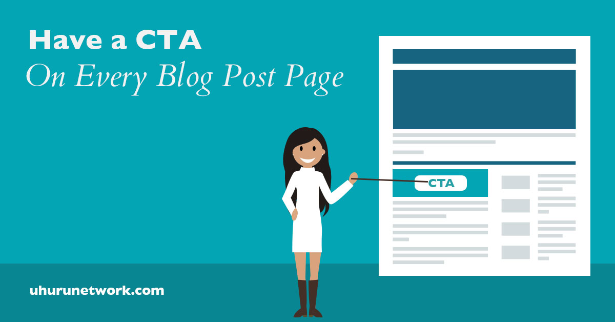
3. Have a CTA on Every Blog Post
When optimizing a website for conversions, one of the first actions we take is we review a website’s top 20 blog posts. On these top 20 blog posts, we see if there is a CTA present on each one, we analyze the type of resource it is, and we analyze its current click-through rate and landing page conversion rates.
What makes a good website great is when the content they spend countless hours crafting actually converts visitors into leads.
The main goal when analyzing top blog-post content is to affect an increase in conversions. By making sure every post has a CTA and it’s the correct CTA to be presented in that blog post, we increase the chances that a visitor will turn into a lead.
This is one of our fundamental principles of web design, but often we see the top content in websites without a CTA at all (or it’s the generic “Subscribe to our Blog” in the sidebar). Make sure that your top content has a CTA and, if possible, don’t just stop at the top 20—do this for all blog posts.
But you need to make sure you’re presenting the correct CTA, which brings me to the next point.
4. Create Personalized CTAs
It’s not enough to increase the number of landing pages on your website, or to place a CTA on every blog post; you need to place the right CTAs for the right visitors to increase your website conversion rates.
Again, what makes a good website great is its ability to convert.
This is where smart CTAs come into play. HubSpot offers a great tool that more marketers should take advantage of: Smart CTAs. With this tool, you are able to present a personalized CTA to your visitors based on lifecycle stage and thereby possibly increase your view-to-submission rate by 42%!
When using smart CTAs on your website you’re able to put something in front of new visitors that is different than what you would show to a lead. For example, you might present a new website visitor an offer to download an ebook guide about SEO, but you would present a lead (someone who already has completed a form on your website) a CTA for a free organic rankings assessment.
Personalization is one of our top web design principles because it can dramatically increase conversions across the entire site. In order to achieve this level of personalization, you need to have offers at every stage of the buyer’s journey, which is explained in the next point.
5. Content Offers at Every Stage of the Buyer’s Journey
We touched on the web design principle of having a variety of content offers and presenting personalized CTAs in order to drive conversion rates. Now let’s touch on how content offers work along the buyer’s journey.
A buyer’s journey is the path a lead takes to convert from lead to customer. What you present to the leads at the different stages needs to be relevant at that stage in their journey.
HubSpot offers a generic buyer’s journey you can use in case you don’t have internal documentation created for this. Awareness, consideration, and decision are the stages in a buyer’s journey. You can use these for your content offer development.
The content offers that a lead at the awareness stage would want are different than the decision stage. When developing your content plan for resources and blog posts consider what triggers a lead at each stage of the buyer’s journey to search for that content and what to download that resource.
For example: let’s say your company provides business consulting services. The awareness stage content offers would not relate to your services or offerings, but would focus on general topics that your ideal persona would be interested in, such as “The Ultimate Guide on Hiring Talented Team Members” or “How to Develop a Website that Drives Sales.” These are two excellent examples of awareness stage topics that would be interesting to a website visitor that ultimately needs business consulting.
Consideration stage content serves two purposes internally: to gather more information from your leads and to move them to the next stage of the buyer’s journey. The content you serve at this stage needs to be related very closely to the services you offer. One example would be a self-assessment that the lead takes to measure how successfully they’re executing a specific area of their business.
Lastly, the decision stage is an offer that gets the lead on the phone. This is a value-added offer that either leads them to a phone call with a sales rep or removes them from the list because they will not convert to a customer. The value-added decision-stage offer could be a consultation, a strategy session, a free trial, etc., but this offer needs to provide enough value that the lead will take action on it.
We’ve said it before and we’ll say it again—what makes a good website great is its ability to engage users and convert them. As you can see, providing the right content at the right stage can make a significant impact on conversion rates.
6. Have a Website Resources Page
A website resources page is another of our fundamental web design principles because it delivers a one-stop shop for all of your most valuable content in one place. A resources page is where you present all of your content offers and other forms of downloadable content in an organized and useful manner.
This is important because it makes it easy to navigate to the right page when a visitor is very interested in what you have to offer. They can then download the resources that they have the highest need for, convert into a lead, and tell you more about the specific problem they need your help solving.
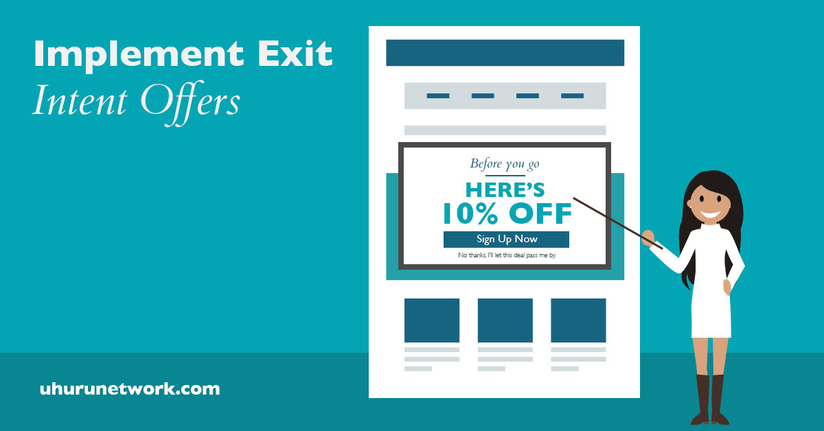
7. Implement Exit Intent Offers
Yes, pop-ups can be annoying and intrusive, but if done correctly this web design principle can really drive website conversions. Have an exit intent offer on pages with low conversion rates.
Present an offer that is related to the topic of the landing page and doesn’t ask for a lot of information on the exit intent. Make sure it’s really easy for them to take action.
Where conversions are the ultimate goal, do everything in your power to capture your visitors’ attention before you lose it (possibly for good).
8. Optimize Conversion Landing Pages
On the landing pages where you want visitors to take one action, make sure you remove any distracting items, such as other content offer pop-ups, menus, sidebars, etc. The only thing you want them to do is complete that form, so make sure that you don’t present any other items on landing pages that would distract visitors.
Landing pages are a major component of what makes a good website into a high-converting, lead-generation machine, so put plenty of care into their design and copy. They could mean the difference between tens and hundreds of leads each month.
4 (More) Principles of Web Design to Engage Users
Now that we’ve addressed principles that will drive conversions, let’s continue with website optimizations to engage users. By the end of this post, you should no longer be wondering what makes a good website.
9. Mobile Experience
Mobile is now becoming the norm and Google will soon put mobile first. This means that your true website will be the mobile website, not your desktop website. What does that mean for you?
You need to ensure that you’re providing an optimized mobile experience and put as much attention into your mobile experience as you do your desktop. The principles of web design will shift as mobile takes on more users, so work to continually update your website with the current requirements to remain relevant.
On mobile, there are experience and design elements that need to be treated differently than on a desktop website. For example, a very large sidebar becomes unnecessary. A huge difficult-to-navigate menu makes for a bad user experience on mobile. Additionally, design elements that don’t work on mobile, such as hovers, should be avoided.
What makes a good website into a truly mobile-friendly website is treating them like two completely different entities. The user experience and the design required to best serve each type of user will vary dramatically. Prioritize mobile or you’ll be left in the dust by competitors that have.
10. Easy-to-Use Website (Usability)
This may seem like a given, but few companies actually stick to this web design principle. A website needs to be easy to use. As with most things in our instant gratification-based society, if a site is too hard to use, the visitor will leave and find a competitor. Today, the time it takes for a visitor to decide if they want to stay or leave is now only a few seconds.
That doesn’t give you a lot of time to make an impression. When evaluating user design, usability needs to be at the top of the priorities list. Why? Because if no one knows how to use your website, your visitor-to-lead conversion rate will be very low to non-existent.
Less Is More
Don’t overwhelm your visitors with too many buttons, colors, headers, etc. Consider using simple icons, images, and clean typography as alternatives to communicate your point where a clear call to action can stand out.
11. Develop a Strategy for Your Website
Strategy is what makes a good website design into a relevant, highly effective marketing tool.
Have a goal or strategy behind the design of your website. Ask yourself: Why do I need to redesign this website? What is not currently working with my website?
It’s very important to know that each page of your website needs to have a clear purpose and fulfill a specific need, which takes us to the next principle.
Design for the End User
Build your website around the user. What are the things your customers are looking for? What are the elements/design, message, and images that will resonate with your buyer persona?
Keep Your Buyer Persona Top of Mind
If your ideal persona is a 50-something executive versus a teenager just starting college, the user experience and design elements you present needs to focus on that demographic. You need to reach a specific target audience, not cast a wide net, so tailor things appropriately.
12. Focus User Attention
Visual elements invite your users to focus their attention exactly where it needs to go. Elements such as arrows, big, bold fonts, and CTAs are going to help your users navigate your site without any confusion.
Visual Hierarchy
It should be easy for users to know what should be read first and what should be read next. Text placement, colors, font choices, and font sizes play a big roll in what makes a site clean, organized, and easy to follow.
Placing content randomly on your web page can end up harming the user experience and give your website a messy appearance. Establish a clear pattern so you can guide the users where you want them to go.
Conclusion
The key to developing a successful website is understanding how to engage and convert your visitors (users). By implementing the principles outlined in this article you’ll have a considerable head start over the vast majority of your competitors.
Remember, what makes a good website is different for every brand and their unique end users. Work to address the specific needs of your users as you put each of these web design principles into practice. It will start you on the path to a developing an effective online conversion machine that acts as the foundation to support the achievement of all of your digital marketing goals.